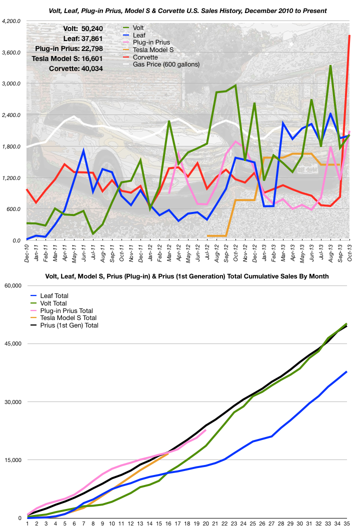
Toyota and Nissan have not yet posted the Plug-in Prius and Leaf numbers but I just couldn’t wait to post this. (I’m using a rumored number for the Leaf that comes from a good source.)
- The Tesla Model S is now being tracked on the charts, taking the i MiEV’s spot.
- Holy cow, what happened to Corvettes???
 I know many of you have been wanting me to add the Model S, but I want only REAL numbers in my graphs (real as in actual, not numbers having fractional parts…). I’ve caved somewhat on this. I am only using official Tesla sales numbers, but they issue them quarterly and don’t break it down by month. My solution is to divide the quarter sales figure by three and pretend they sold the same number of vehicles each of those three months. You can see the result of this in the stair-step shape of the orange Tesla curve in the upper graph.
What can I say? It’s a compromise…
As for the standard ICE vehicle, to which I’ve been comparing EV sales, the Corvette sure is a surprise this month. Do you think anyone was waiting until the 7th generation body style became available?
The Volt and Leaf both saw minor improvements over the previous month and the Volt has increased its acceptance rate lead over the acceptance rate of the original Prius. Last month, the Volt lead by 36 (48,218 vs. 48,182) units sold. Last month’s sales increased that lead to 601 (50,240 vs. 49,639). Volt sales increased over the previous month by 14% (2,022 vs. 1,766). The Leaf’s increase was only 3% (2,002 vs. 1,953). *UPDATE* Wow! BIG news here. The Plug-in Prius’ sales increased dramatically from the previous month. The increase was 82%, (2,095 vs. 1,152) which put it in first place for the month, among the EVs I’m tracking, edging out both the Volt and Leaf. In fact, these three vehicles’ sales were all within a band of 93 units. It makes for an odd intersection on the upper graph’s right-hand side. Last month was the high water mark so far in Plug-in Prius sales. The Tesla Model S’s sales slowed a bit in the U.S. The previous quarter, Tesla sold 4,966 units (averaging 1,655 per month) and in the most recent quarter, they sold 4,338 units (averaging 1,446 per month). This represents a decrease of 13% from the previous quarter. That gets us up to the end of September 2013 for Tesla. That’s why their curve in the upper chart doesn’t make it all the way to the right side like the other vehicles I’m tracking. They haven’t given us everything the other manufacturers have given us.
The odd thing about the lower chart is how the Tesla Model S, Volt and Plug-in Prius all seem to be gravitating to the original Prius’ acceptance curve. Even the Leaf, although well behind the pace, seems to be running parallel to it. Anyone want to venture a theory on this phenomenon?
There was news there in that last paragraph. At some point last month, the 50,000th Volt was sold in the U.S. I haven’t seen any press release on it. I wonder if GM knows who that lucky person is… (lucky because they bought a Volt, not for being #50,000)
The upper graph is approaching the end of its usefulness. As more months get squeezed into a 710 pixel wide graph, those curves are going to get mashed together. I’ll trust my readers to let me know when they’ve tired of it or I’ll just let it get wider and wider and wider…
Speaking of readers, I am happy to announce that, as of today, My Electric Vehicle Journey has 347 subscribers! Thank you all for your interest. The blog seems to be doing especially well in Poland, but I’m not sure why. In recent weeks, new subscribers have been joining at the rate of about 5-7 per day.


Another “Great” report, Buzz!
I’d be happy to see just the two past years on the charts, fwiw.